
PLANNING
BRAND DESIGN
on this page;
-
Mood boards/ideas generation
-
Sketches/mock ups
-
Colour palettes ideas/trials
-
Typography ideas/trials
-
Imagery ideas/trials
first moodboard

more refined moodboard

From my moodboard creation I found a lot of simplistic, calm coloured and natural designs that were easy to read and self explanatory. These designs generally included green, brown, yellow, off white and orange. These are very neutral together and is the go to for natural brands, because they reflect the colours of nature. Because this so firmly a cultural expectation, it seems universal in this market, if I vary from this I may lose its instant appeal and audience connection. Therefore, I will be featuring these colours in my colour palette ideas. I could experiment and try something new, but due to a lack of time I wouldn’t be able to get enough thorough feedback on the designs. I am also going to trust the research of previous designers regarding the fonts and how their target markets have responded to them, previously. This means I’m referencing the fonts on this mood board only. Narrowing down my moodboard helps with moving forward as I can easily make the decision of what designs to use that are most liked by me as a designer for my audience and what suits the project.
When looking at my moodboard that consists of multiple natural themed logos, I noticed a lot of repetition in the colours such as green, brown, yellow, off white and orange. These showed up a lot between different designs so I will be using these colours in my colour palette as shown. I am not considering different palettes as I have limited time for this part of my project and I will be using one or two of these colours in my four concepts during the next stage so these are plenty. Thinking of environmentally friendly ink, I could use dyes from plants, straight onto the cardboard box, if I were to make this product in real life I would look into that for final production.
colour palette

design concepts


When making my initial mood board I was looking for designs that resembled healthy design features, that are implemented to help the viewer make that connection that this brand is healthy. Mostly natural colour palettes, plants, organic fonts that are easy to read and retro features are used. As the retro styles harken to the past, are seen as old, this connection can seem more related to nature for some, as our present world has progressed away from nature to the more urban and technological. Therefore, the retro style insinuates a nostalgia for a more wholesome time. People also tended to cook more from scratch in the past, as there was less readymade off-the-shelf products, and more time to prepare food. These are the four images that stuck out to me when I started sketching out my first concepts. They seemed to embody the main features that I had identified as conveying ‘fresh food’ identity. I made sure to use parts of the references and develop around it. For example, my idea 2 has the big F that is used on the orange ‘Floyds’ logo as it looks classically retro.
asking my audience


my thoughts and response


+
The first question for my audience was how old they are - so I could see what age groups were responding. It was mostly 30-45’s as the older members of my family were giving additional support in finding participants. That age range is right in the centre average of my demographic so it's a good middling sample group and links all opinions of design features. Everyone's favourite design was number three, which disappointed me because I was hoping number two as it matched my brand the most. The main thing they liked about number three was having that light green. My audiences second favourite was number two, which was amazing news as I could just apply that green to the option two and have that as the logo. People liked the fonts I used in number two as well so overall this is a good step. Overall doing this was very helpful for my project as I now know what my audience wants to see and this will help me design a recipe. I was expecting people to like number one and two the most but barely anyone liked number one.
PRODUCTION
BRAND DESIGN
Final logo and menu design based on logo.

With this logo I just took the original design for number two into Illustrator and outlined the hand drawn word ‘fresh’ to keep that organic text style as I couldn't find this as a downloadable font. The ‘&’ and the four leaf symbols were also outlined from the original image. The reason I outlined these was to keep the organic and hand written style that everyone in my feedback said they liked about this design. The only thing I had not directly made was the writing ‘simple’ as I was able to find a free downloadable font that resembled the original designs subheading. The only other thing that is different is the coloured circle which was made green in response to my google forms where people said they preferred number three due to it featuring green.
Box mockups for designs


When searching for box mockups I had to take into account that the boxes would be large scaled crates. I found a box mockup that had plants in the design complementing the natural aesthetic. Previously in another project, I used a mockup that had plants in the frame, it was the mockup that got chosen by my audience and their main reason was the plants. The plants provide a feeling of natural freshness and enhances the image, making it look more styled and professionally composed.
The reason I have a crate that has handles and another that is open is because I am thinking of putting the recipe in the lid or on the side - this is for ecological reasons to cut down waste by using less resources, rather than an additional printed leaflet. The reason I have chosen to have a lid open, or no lid , in the image is because having the recipe printed on the outside of the box may result in some of the writing getting removed/scratched off in transit rendering it useless. Although I like the design with the plants, the box designs don’t really work with my product due to the scale, as they are designed like cosmetic boxes.
Chosen Box Mockups


Here are the chosen mock ups that I have decided to use, due to them looking quite similar in design and proportion. They are both cardboard textured which is what I wanted in my design. I also wanted to minimise ink usage by having a simple design as well as using dye from plants - which is both economical and ecological. This gives the impression of being authentically eco friendly to the buyer. Any savings will be passed on, to the target audience of 20 - 85s by keeping down costs which is one of my main aims - making it accessible to more people which is my goal.
With the single box I have chosen, I don’t have the ability to have the recipe inside the lid of this image, as the lid inside is barely visible. If I made the product for real I would have the lid positioned differently in the advertising so the recipe is visible to the viewer. For now the recipe will be placed on the side of the box so that it can be presented in the image at least.
Questionnaire for logo placements

feedback from audience


final designs on box


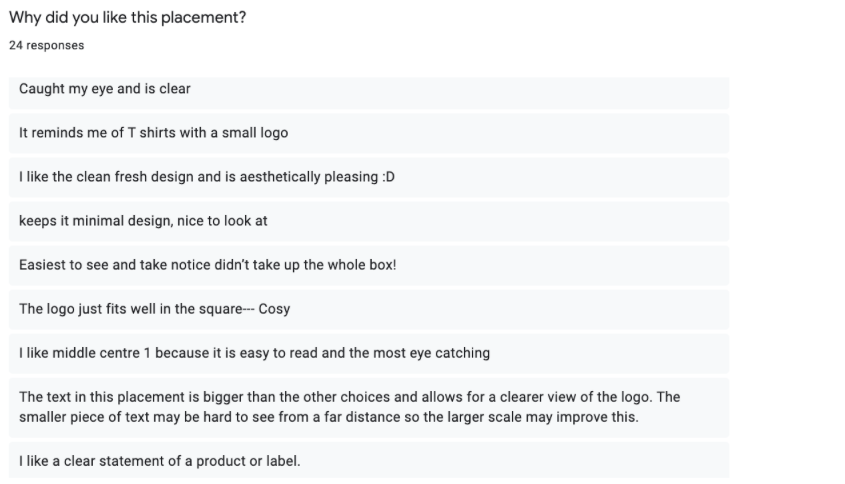
Here I made a google forms to find the right placement of the logo and recipe designs on the boxes. My personal favourite placements were the top left corner (2) and the middle centre (1) so I was assuming and hoping that my target audience group would agree with me. I received 21 responses. The first question I asked was their age, and over half were 30-60 year olds. This is because I had help distributing it from the same people as my logo design questionnaire. As previously explained, this was useful due to the fact it covers a rough average of my target group, 20-85 year olds.
Directly half of the response agreed with my personal choice which was very pleasing. This has given me a sense of confidence that I am learning to successfully predict what an audience would find appealing. In response they said “The text in this placement is bigger than the other choices and allows for a clearer view of the logo. The smaller piece of text may be hard to see from a far distance so the larger scale may improve this”, “Caught my eye and is clear”. Therefore for these reasons that placement will be used.
Poster and End Card of Animation Design

I realised I needed to make an end card for my animation, this is the design I came up with last minute. The title is the same font as the ‘simple’ from the logo design, this is to keep coherence between the deliverables. This will be put over the end of my animation with a transparent transition to smoothly introduce the ending. This is also being classed as a poster as viewers will relate it to the animation and may want merchandise from the product.