
PLANNING ANIMATION
Project;
My project Aim is to create a 40 seconds max frame by frame 2D Digital animation, tube advert (big poster advert), an instagram page for social media publicity and package design for my own made healthy and affordable food delivery service.
Animation style moodboard
The first animator’s art and style I thought would fit for this project was Tom Law on Youtube. their animations caught me because it is a very fun, cute and gives a ‘homemade’ feeling due to its cartoony line work and proportions. Although this is a very loved art style I realised it does not fit with my original inspiration which is the japanese ‘anime’ style, which is a bit more to the proportions of real life people.
The second animation is by Angie Timsel on youtube. This other type of cartoon style is when the proportions of the characters are like real life until you reach their (big) heads and clothes that are exaggerated. I considered this style because it is very charming and a lot of people like to watch animations with this style. I might use it because I plan on having some characters in hoodies due to being at home and this style displays bulky comfy clothes.
The next inspiration I came across was made by KAERU FILM on youtube, this animation caught my attention because the style uses colour blocking and no line art, I usually use this style when I’m making animations on procreate so I thought maybe? But this project may be made on Adobe Animate which uses primarily line art when it comes to frame by frame animations. If I end up using the software Krita I may do no line art but I am trying to achieve a more popular cartoon style to reach everyone in my target audience. The animations that I am probably going to use are these last three. The first two of the three is by the Youtube animator and artist アボガド6 which translates to Avocado 6.
These particular animations by this artist inspired me because of the many hands that are featured, I am wanting to use this style of movement and line work, maybe a bit simpler due to time constraints but this is basically what I’m going for. The last animation of the three is by Cudlil on youtube, they have this character that is featured throughout all of their animations, this one was the longest that featured waves moving on the shore, this is sort of how I want to make the food look in my animation, it is aesthetically pleasing and moves smoothly.
These last three animations are great for my project because they are all easy to animate in the sense there is only the detail that is needed and the backgrounds are basic but not too boring. The art style matches the original inspiration being the Japanese ‘Anime‘ style but it also mixes in a simpler cartoon style making the characters easier to read.
Animation Practices
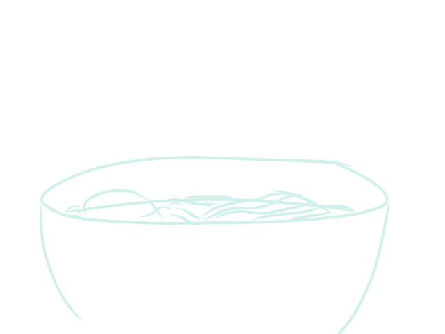
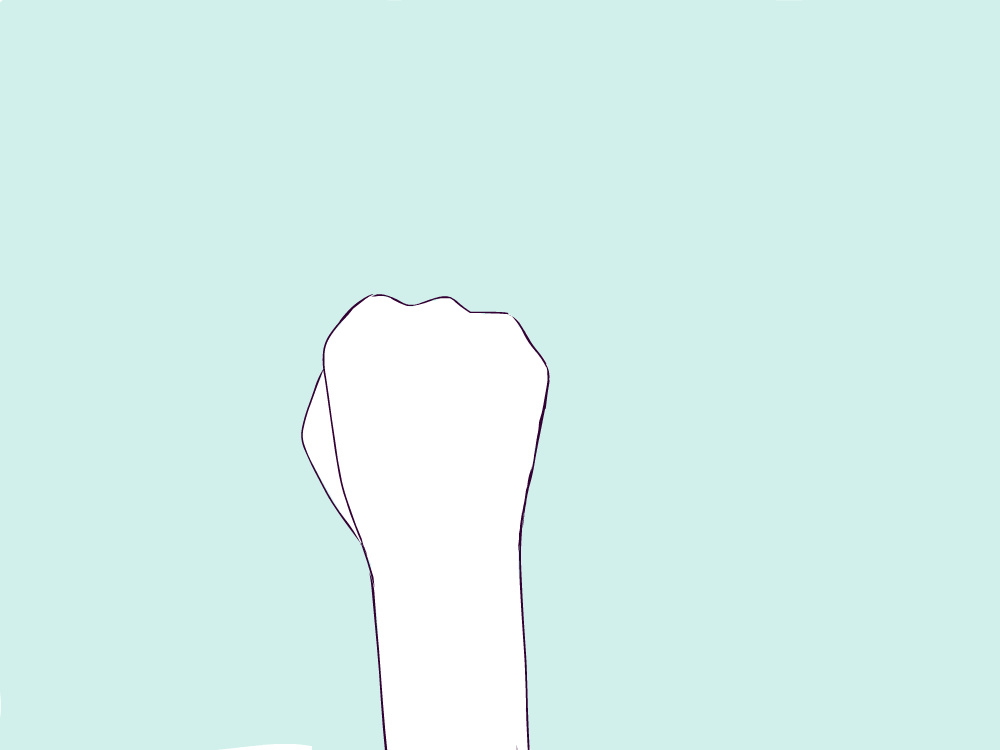
These are some small animation practices based on my project concept and the animation style that I have chosen at this stage (may change later). The hand animation had no reference other than my memory of Avocado 6’s short animation. The method used for the hand animation was drawing each frame as I went, this animation had a lot of experimentation as I had not done a hand animation like this before especially without direct reference. I wanted to practice a bowl of food, as my final animation will feature lots of food shots, I also had no reference for this. The method I used for the bowl animation was making keyframes and then adding the in betweens to make it smoother. This method worked for the food because I was playing with perspective which is hard to display, so making the three parts where it is sideways, half way and flat on the table helped me achieve what I wanted.
These techniques that I learnt off of many animator tip videos are going to be applied to my project when I am animating. I will be primarily using the keyframe technique where you make key frames then fill in the gaps after to make it smoother, this is because I’m going to make a storyboard so I know in more detail what I'm making. Making these animations is helping my project move forward because I am able to imagine the style Avocado 6 from youtube holds in their animations onto what I can make. Allowing me to further make the decision of using their style for the hands etc.
Character moodboard

Refined Character moodboard

In my character design from the very beginning I had imagined a man cooking in a kitchen for the opening scene (this will probably change) so I automatically added male anatomy and characters to my first moodboard. I also draw a lot of females in my artwork and animations so I want to put myself up to a challenge. These moodboards have heavily featured hands structure, I have made sure to include this because I know in my animation hands will be featured a lot more. I will make a hand animation without reference in my production log to see how I do when animating hands in this stage. I will be taking inspiration from this youtube video that only features hands in the simplistic anime style founded in Japan. Because my character will be at home cooking they will most likely be wearing casual comfortable clothes such as a hoodie and jogging bottoms, that is why I included in my refined moodboard this diagram displaying how to draw hoodies and their hoods on a character, this will help with my concept sketches quite a lot. For the characters face and age I wanted to do someone in the age range of 35-40 because that is the middle age of my target audience which is 20-85. This is to make sure it relates to the viewers as much as possible. My first moodboard has a lot more reference sheets, formatting templates etc. so I will be going back their for height and hand design. Near the end of the animation the character will put the food down on the table for their partner and child to eat, I will make their designs randomly and have it simple as they aren't going to be featured as heavily during the animation as this character will be. They will probably be a homosexual couple with a 5 year old daughter.
Artist Analysis

The artist I am analysing for my character design is ‘Musa’, their age is unknown publicly and they identify as They/Them. The first post that is shown on their instagram was made JULY 14, 2018 although from other posts and their other platforms such as Tumblr, I know they’ve been on social media posting art as far as 2013, which would explain their mass following. The art piece im analysing was posted on instagram JULY 14, 2018, this was the only place I could find posted with a date. The image was cropped smaller and zoomed into the partners head, this indicates that this piece may have been made prior to this specific post date. The way I found this artwork was through another art piece on pinterest, after finding this piece in my Pinterest character moodboard I went to the link that was connected to it. The link lead me to the artists tumblr that was very long to scroll through and went all the way to 2013 (maybe longer, I couldn’t go all the way). I wanted to analyse this piece out of all the other pieces they have made because this is one of the few drawings they have done where the eyes are in this style, usually they are more expressive and detailed. This is the specific style I wanted to use because generally less detail is best for animation production. The drawing shows two characters that have a similar relationship to the characters I am making for my project, which is a pleasant surprise. This artist conveys the older and mature look these characters hold very well by using receded hairlines, eye bags, scruffy hair and body hair.
Character’s Family moodboard

This moodboard was based off of my vision of how the family would look, the characters partner will be male and their child will be a little girl, this is to include some representation in the Homosexual community- trying to push that there are families like this. I am not doing a ‘Nuclear Family’ because that is too cliche, although it would be good for my broad audience, it would just look like all the other family adverts like this and render as generic in people's minds. The child concept designs will have different hairstyles and facial features displayed in the mood board, this is so that my audience has a variety of designs to choose from in my google forms, especially because the child will be very simple with big eyes and a cute expression throughout. The characters partner will be very similar looking to the main character, maybe with more hair etc.
Character sketches


When it came to these sketches I had taken inspiration from the artist ‘Musa’ that I have previously analyzed. The characters eyes are all made in ‘Musa’s simple design types for animation purposes. These character designs were made to fit to my audience age groups which are adults. I wanted my characters to look cheerful and friendly to create a sense of wellbeing and cheerfulness. There are also daughter designs due to the fact this product is aimed at families. I also designed my characters to look slim and healthy to convey a sense of well nourished people.
audience response

Main Character designs

Daughter designs

The first question I asked my participants was their age. They were mostly in the 30 -45 category which is practically in the average age of my target audience (20-85). This is good because of my wide age range, as a middle point is a good average of opinion. The first character design was six variations of ‘Guys’ designs based on my artist analysis that I made previously. The most chosen character design in my survey was option two. The second most chosen was option six. These male character designs are mix of the main character and their partner - my thought process was that the second favourite would be the characters partner and the most favoured would be the main character. For the daughter designs the most chosen was option four, this character has a ponytail and a generic young girl face, utilising the same style as the male to provide a cohesive style. I was in agreement with my participants that option four was preferable although I was equally in favour of option five.
food moodboard

refined food moodboard

In my specialist study I mention how this project was initially inspired by anime food compilations that were viral on social media platforms during the christmas break of 2020. This moodboard is mainly based on these compilations I originally was inspired by. They feature different types of meals being prepared and the visuals are extremely satisfying, they make you want to eat what is displayed. This is exactly what I want my target audience to think and feel. This will be a very hard animation to make due to all the highlights and soft movement cooking can feature especially in these videos. I want to have my character make a dish that is healthy and large enough for a family of three. This is because my target audience is mainly parents from families and people who live alone but want to be healthy, both want an easy way to eat good and healthy food. Most of the images in my moodboard were GIFs but I cannot display them in this image as it is a screenshot.
scene moodboard

refined scene moodboard

This is my pinned down mood board which displays the aesthetic I want to convey in the scenes I will be developing. I’ll be producing these scenes in Procreate (software for the iPad) before I finalise my animatic and storyboards. I will be using establishing shots at the beginning of my animation to show the viewer where the characters live. I will also explain visually that they will have a delivery of food from my brand, by showing road shots with a delivery van.
There’s a video on youtube where a musician called ‘mabel ye’ made a song and produced an animatic to go alongside it. The beginning of this video has a shot of a moving tyre, I will be using this video as a reference when making my animation. I may use the tyre moving as my first shot and then follow this with the establishing shot of the truck coming up to the house to deliver.
Artist Analysis

My chosen artist publicly goes by the name 샤토(shato) she is a woman and lives in Korea born in 1895(stated in her bio…), they are famous for their artworks on twitter, instagram and pinterest. They are more of an internet artist so there isn’t much information about them other than what I could find on their twitter and account. The reason I'm choosing to analyse this artist is because when I was looking on pinterest for scene ideas her art came up multiple times with aesthetic soft art that displayed this characters life which is mainly in their home with their friend. The art piece I have chosen was posted on twitter, it was posted 10:51 AM Jul 6, 2020 and has 3,145 Retweets 115 Quote Tweets 14.1K Likes. This artist uses a display pen tablet and uses the Adobe software Photoshop to produce their art works, they are all 2D digital artworks although their older posts feature some traditional art. I know this because of a few of their posts featuring their cat stopping them from working on their desk. Their style is very much based from the notorious Japanese Anime style, big eyes and simple features allowing for complex clothing and environment design, especially in this artists work. They work with thin lines and flat colours with a touch of shading and lighting to enhance the laid back aesthetic, their colour palette is usually quite low on the side of hue and value but remains pastel and calm, working with lots of greens, blues and browns which are notably very monotone. This artwork specifically features a kitchen, for my project I plan to have a kitchen involved as a scene design so this is perfect to analyse. I especially like the feature of the main characters friend cooking for them, as I plan on maybe having a kid or family member being featured at the end and eating the food that is shown being made. The kitchen displayed in this art piece is very modern, featuring a countertop that links into a table, tiles on the walls and aesthetically pleasing studio esc lights. This artists work commonly features cats and I feel as though it pushes the momentum of that home feeling they are trying to give the viewer. The message in this artwork is to chill out and enjoy life from where you are. The feeling it gives me and I'm sure the viewer too, is calm and taking your days one at a time, not worrying and to just vibe, which is perfect for me because home is the life we are living under this global pandemic. From this artists work I will take certain features to help present my work. I will be using a similar colour palette, kitchen tiles, wooden floors, maybe cats and a family member in a scene watching the dad cook.
Scenes and Storyboard Sketches.


Here are three of the scenes I have managed to create so far. This is the first ones the viewer will see in the animation so at this stage they are the more important ones. I just took the scenes from this storyboard and lined over them then shaped them up a little. This storyboard is what I had in mind when looking at scene ideas in my moodboard and I used a technique of lining the backgrounds and the animated objects in different colours to make it clear that they have different functions within the scene.
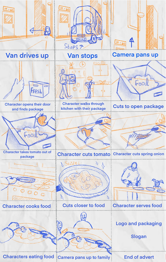
Storyboard animatic
When making this animatic I grabbed the original story board and adjusted it to fit the size of each frame in this digital canvas. I used Procreate for this. There are some frames that will be longer than the others, so I set a duration for certain frames to show in the animatic what the timings will end up being. There will be more animatics to come after the style frames are made and the scene designs have been finished in procreate.
General Animation Improvements
Here are some videos I found on youtube that are to help improve ones animation skills and show the process you would go through to get a certain movement style and aesthetic. The video that helped me the most was by ‘zemyata’ their video had the whole process of a very short animation they made on their ipad using multiple applications- Cute Cut Pro, Procreate and Doink Animation. The film showed me that having an animation sketch as part of the ongoing process is very normal, that you render as you go along. They included all their thoughts and changes in the self evaluation video that they published which showed their process. The way that they figured out the scene designs is also helpful to me as it shows how they got to the final design. By taking current and already existing food shops and changing the angle, style and colour palette to what they were envisioning for their animation - they were honing their creative abilities.